The development of project management thinking and new techniques has at times been slow and deliberate. Perhaps, this is in part, due to the fatalistic feeling that the very nature of project environments is contributing to the willingness for accepting the status quo.
The Pyramids and Sphinx’s were certainly projects yet how they were built remains as mysterious as the artifacts themselves. Millenniums would go by before Henry Gantt developed the Gantt technique in the 1920’s. In the late 1930’s Operations Research efforts contributed significantly to better understanding the relationship between task dependencies and the impact of constrained resources that led to the concept of Critical Path. Then in the late 1950’s The US Navy in collaboration with Booz & Allen developed the Program Evaluation, Review & Technique (PERT).
Starting in the 1960’s the emphasis shifted to taking advantage of computers to improve project management. There were many contributors, such as John Fondahl at Stanford University, developing the algorithms that were to become the foundation for the project management software tools that are prevalent today. These tools offered new features to plan, schedule and execute, however, the thinking captured in the algorithms for the most part was not new.
It wasn’t until 1997 when Eliyahu Goldratt published the Critical Chain introducing the Critical Chain as an alternative to the Critical Path did we have the next major change in project management thinking. There are many adaptors to this way of thinking. Regrettably change as we have seen comes slowly and it will take additional time before the full impact of Critical Chain methodology is totally understood across the project management community.
So, the pattern has been established. We first see new thinking evolve and then tools developed building on these advances, producing powerful breakthrough solutions. With Gantt, Critical Path and PERT they used the technology available, initially paper charts and graphs, evolving into software solutions. When Critical Chain appeared, the solutions developed immediately leveraged the existent availability and capabilities of computers and software. Improvements using Critical Chain thinking without software could be achieved, however they cannot benefit from the wide and far-reaching disruptive technology that was now available.
We must now break the pattern. I believe the next breakthrough will require challenging our own assumptions to push the envelope of current Critical Chain thinking. We must leverage the significant advances in computing power; advanced software technology and means of delivery in order to have new thinking evolve. This very well may be creating new knowledge … you will be the judge.
The Critical Path is defined as the longest chain of task dependencies in a project. While the Critical Chain is defined as the longest chain in a project taking task and resource dependencies into consideration. The current thinking is what I will categorize as two-dimensional. Although powerful and advanced, the thinking and subsequent tools developed to date were influenced and limited by the technology available. The focus was primarily on improving the capabilities of the current tools and by adding new and useful features. Clearly adding value while providing a broader spectrum of options to the users. However, it would appear the current Critical Chain solution is still two-dimensional, not leveraging and pushing the envelope to develop new thinking. This two-dimensional thinking led to development of software tools with:
- Critical Chain
- Buffers
- Fever Chart; Project Buffer penetration vs. Critical Chain remaining
- Critical Chain schedules with Buffers
- Buffer Management
Critical Chain – The Critical Chain is defined as the longest chain of dependencies taking task and resource dependencies into consideration. It is the constraint of the project. This is different than the Critical Path, which is defined as the longest chain of task dependencies.
Buffers – A buffer of aggregated safety is placed at the end of the final task of the Critical Chain. This final task is by definition also the final task in the project. When building the Critical Chain schedule all of the embedded safety within the individual tasks are extracted and a portion of the removed safety is placed in various buffers throughout the schedule. A portion of the removed safety is placed after the final task of the project and is called the Project Buffer in order to protect the delivery date. In addition, a portion of the removed safety is placed at the convergence points, where a non- critical chain task feeds into a critical chain task. These are called Feeding Buffers. These convergence points are referred to as integration points and are areas of inherently higher risk. They provide extra safety to immunize the Critical Chain from the impact of a non-critical chain task finishing late. Once the project starts and delays are encountered, the individual tasks will ‘borrow’ time from the Buffers, thus protecting the individual tasks, Critical Chain and the project due date.
Fever Chart; Project Buffer penetration vs. Critical Chain remaining – This is a twodimensional chart displaying the Project Buffer on the vertical axis and the Critical Chain on the horizontal axis. This provides the user with information on how much time is being ‘borrowed’ versus the progress of the Critical Chain. Unlike Critical Path methodology where the Critical Path changes, the Critical Chain should not change during execution thus providing a reference datum plane when variability impacts the schedule during execution. This is a major distinction between the two different techniques. Stability and Control are prerequisite necessary conditions for successfully managing projects and they will be addressed later in the paper.
These are some of the essential elements of the Critical Chain solution providing actionable information and execution techniques. When first introduced to these breakthroughs software tools in 1997 I was amazed at the innovation and simplicity of this project management disruptive technology. However, while providing perspective to my assertion that they are two-dimensional, this is not a pejorative assessment; this is simply a statement of fact. Time will wait for no one.
In The Haystack Syndrome Eliyahu Goldratt identified a fatal flaw in the thinking of all of the MRP scheduling algorithms that was further duplicated in subsequent MRPII and ERP software solutions. The software algorithms built all of the individual work order routings in isolation, and then combing them together resulting in sub-optimized master schedules. They failed to leverage the existing technology that would permit looking at all of the routings together that would produce a much superior optimized master schedule. Their thinking was developed when computers did not have the random access memory (RAM) to look at all of the work order routings at the same time. When the RAM became available they used a well-established pattern. We first see new thinking evolve and this will become the de-facto basis for developing the software solutions. They were blocked from seeing that the new technology should have driven new thinking, leading to a muchimproved set of solutions.
I was privileged to have attended a seminar given by the late British historian and philosopher Arnold Toynbee and indelibly heard him say, “History does not repeat itself, events reoccur.“ So can we draw some parallels and learn from history without being doomed to repeating the same mistakes?
First, we must take a look at where current thinking has taken us. I was initially introduced to the Fever Chart in a discussion with Robert Newbold and it is one of the most useful informational displays provided by the Critical Chain solution. The amount of penetration of the Project Buffer is displayed on the vertical axis. Think of this as borrowing time from the project ‘Time Bank’. The percent of Critical Chain remaining is displayed on the horizontal axis. The resulting chart is divided into green, yellow and red zones. This was a brilliant and innovative way to visually see if the project was consuming an acceptable amount of buffer vis-à-vis the amount of Critical Chain remaining. The Critical Chain pathway will not normally change in execution, thus providing a datum plane for measuring the impact the inevitable variability is having on the original schedule. In addition, a histogram of the Project Buffer penetration is generated when the chart is updated on a daily or weekly interval. See Figure 1 below.
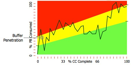 Figure 1.
Source: www.vectorstrategies.com
The challenge was that initially a considerable amount of time goes by before the yellow and red zones will be penetrated. So, in order to highlight and create a sense of urgency whenever there is an unacceptable trend of excessive buffer penetration, the zones are skewed, leading to an early entrance into yellow and red zones.
Another limitation of the Fever Chart is the assumption of linearity distribution of the tasks in the project. This produces a notional or ‘average of the average’ depiction of a ‘one size fits all’ project. In other words the ideal buffer consumption vis-à-vis Critical Chain completed would be a 45-degree slope, this of course is never the case. The task distributions in most projects are unique and significantly different. The Theory of Constraints (TOC) has classified different types of task flows, such as V, A, T, and I which are described in the TOCICO Dictionary. This refers to the general workflow; in a V type project there are a lot of initial divergences of the workflow that will eventually converge into the final part of the project. On the other hand in an A project, the workflow will converge initially and throughout until the project is completed.
Therefore there will be a non-linear and different distribution of the tasks in every unique project. The workflow will significantly influence the amount of tasks being worked on at any point in the life of the project. In addition this will determine where the highest risk areas needing the greatest feeding buffer protection are located. So neither the work content nor the risk vulnerability is distributed linearly.
The Project Buffer as explained in the Critical Chain and as defined in the TOCICO Dictionary is placed at the end of the final task in the project and is divided into three equal zones of green, yellow and red. This is depicted in Figure 2.
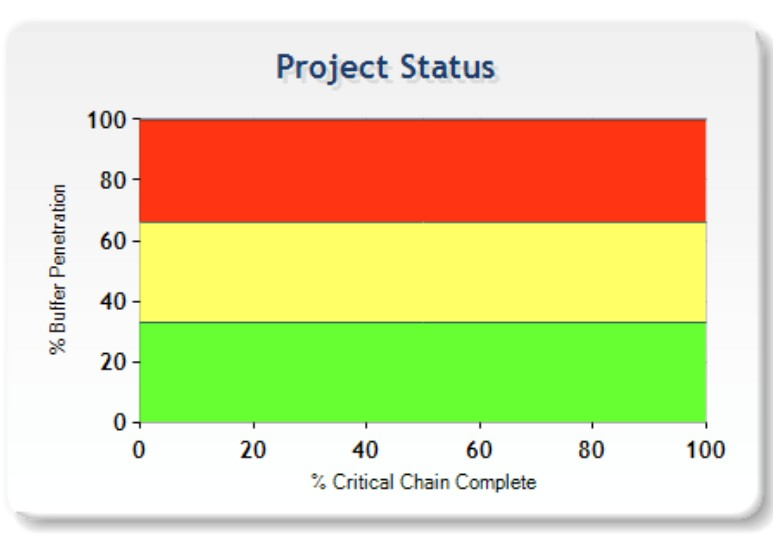 Figure 2.
Source: www.exepron.com
Now it would appear this is consistent with the concept of three equal zones.
However it does not convey the early sense of urgency communicated in the Fever Chart, Figure 1. It must be noted that the Fever Chart in Figure 1 is not consistent with the actual status of the project buffer since it does not map back to the welldefined three equal zones in the Project Buffer. At the end of day the adaption of the Fever Chart with the information provided was a wonderful compromise and overshadowed the inconsistency of not showing the true zone of project buffer penetration. As we all know when an inconsistency is ignored for the greater good there may be unintended consequences. An interesting question that should be asked is why did this happen?
The people responsible for developing the Fever Chart should more appropriately answer this, but I will not let it get in the way of speculating. Perhaps it was due to the limitation of the prevalent thinking being blocked by the limitation of the available technology. The time to push or even expand the envelope has come. In order for an approach or solution to improve it must change, this means the current assumptions must be carefully scrutinized.
The improvement must focus on building on our collective experience with Critical Chain methodology, developing new thinking while leveraging the significant technology advances vis-à-vis attempting to improve the existing Fever Chart. The following display, Figure 3, was developed in order to align the actual Project Buffer penetration with the amount of Critical Chain remaining. The Project Status Chart∗ shown in Figure 3 was kindly provided by Gerry Kendall and is an actual project in execution.
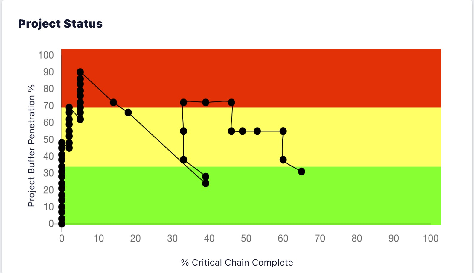 Figure 3.
Source: www.tocinternational.com
This represents 2 variables, the x and y axis displayed as a single dot, showing the relative the amount of Critical Chain remaining vs. Project Buffer penetration. This is an absolute, not a skewed Fever Chart notional depiction. The conventional thinking was that the schedule and informational charts such as the Fever Chart would be updated daily or even weekly. Again this assumption may have been clouded by limitation of thinking, influenced by the limitation of technology. The chart in Figure 3 is updated in real time; every time a task in the schedule is updated, all of the informational dashboards and charts are updated. Even though we addressed a Fever Chart inconsistency, the sense of urgency feature was now not available. Before this is addressed another question must be asked.
Perhaps the most frequently asked question during project execution is, “Will the project finish on time?” Let me share this with you, the Fever Chart cannot answer the question nor can the Project Status Chart∗. Amazingly people believe the Fever Chart provides this information, it is an illusion. There is no time horizon in a two dimensional chart with the two variables: Project Buffer penetration and the amount of Critical Chain remaining. One can for example use the histogram dots to calculate a best fit or regression analysis trend line. These are notoriously unreliable and are dependent on events that occurred in the past to predict the future. If you use this trend line you are ignoring the amount of work remaining. Let me share the following scenario with you.
Let us say for example the Fever Chart may be showing 25 percent of the Critical Chain remaining with 75 percent Project Buffer penetration, you may be somewhat concerned but this represents the equivalent of a 45-degree slope line. I should have enough Project Buffer remaining and with close management attention the project will make it. But let us say 50 percent of the work content remains. You are going to run out of time because you need more time than available, therefore the project is in serious trouble. I suspect this is a major issue in many projects and the user may not see it coming. And perhaps contributing to some people believing “Critical Chain doesn’t work in my environment.”
So if we want to answer the question we must expand our thinking. The current
Critical Chain solution is a two dimensional solution to a three dimensional problem. The two dimensions are the Critical Chain and the Buffer penetration. The new solution is actually quite simple on a conceptual level but somewhat more challenging to develop. There are several key differences that set TOC, the basis for Critical Chain, apart from other methodologies; the emphasis on managing time is certainly one of the most important differences. It is curious then there are no Time Meters in the current TOC solutions. So it would appear that Time is the third dimension needed as seen in Figure 4, for a new solution that will answer the question, “Will the project finish on time?”
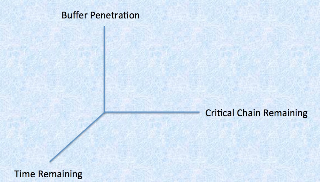 Figure 4.
The available technology permitting real time updating makes the Project Status Chart possible, Figure 3, de facto broke the pattern and drove the new thinking. Again rather than improve existing solutions we must develop new solutions. In order to produce a Time Meter, an algorithm with more than just two variables had to be developed. This requires identifying multiple additional variables, including all of the Feeding Buffers. The Feeding Buffers are probably the most underutilized part of the Critical Chain solution and subsequently have not been leveraged to their full potential. They in fact are the ‘canary in the mine’ that is being ignored. It appears that the current thinking understands the concept, accepts the concept, but curiously for the most part their true contribution not fully developed. Again it probably was the limiting effect of the technology available when the original Critical Chain solutions were developed. This is not a pejorative criticism rather an acknowledgement of what was feasible at the time.
Adding the time dimension is crucial and necessary for developing a solution to answer the question, “Will the project finish on time?” What everyone; the customer, the leadership and the project manager want to know is now within their grasp. Having real time information available showing if there is enough time left to finish the project. So how should this information be displayed and how current should it be? Before going any farther into the solutions, Figure 5 below is what the new key algorithm display looks like.
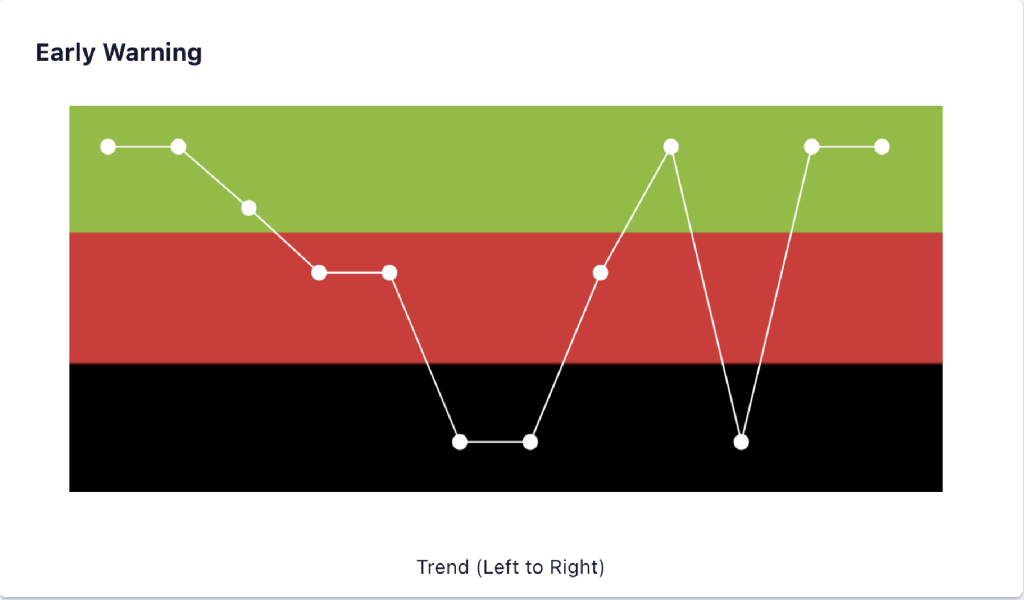 Figure 5.
Source: www.exepron.com
The algorithm is called Early Warning∗ and is calculating how much time is required to finish the project and comparing it to how much time is available in order to meet the Project Due Date. Every time a task in the schedule is updated a white dot is generated in real time, this a rolling display showing the last 10 updates. The dot on the very right is the latest update and is the latest status of the project. As you can see this also presents a historical 10 data point trend chart. There are 3 zones: Green, Red and Black.
- Green Zone – The project is executing well
- Red Zone – The project is experiencing problems and intervention required
- Black Zone – The project has a very high probability of being late
When I have asked people in the many companies I had the privilege of working with to share the reason their projects are late, the responses vary however there is a common theme. They revolve around the theme of; I did not have enough resources … not enough priority … the weather, etc. … Interesting but they are just describing excuses. The reason their project is late is they ran out of time. Now before you dismiss this as a blinding glimpse of the obvious, why aren’t we measuring how much time we have remaining vis-à-vis the time required to complete all of the requirements?
Well, the answer is that up until now, we couldn’t. The Early Warning∗ now provides two types of information:
- Displays a trend line
- Provides the confidence level of finishing on time.
I was very fortunate to have attended a three-hour lecture given by Peter Drucker in 1979 where he made a profound statement, “If you want to predict the future, you must control it.” It had an indelible impact on my thinking from that moment on. In the years that followed, multiple attempts to follow his advice produced some degree of success. Now however by building on the previous efforts of many individuals, leveraging available technology, and challenging accepted assumptions the challenge of Peter Drucker has been achieved in project management.
The Early Warning∗ is an important part of following his advice of predicting the future, but in of itself is not enough to control the future. Fortunately Critical Chain methodology paves the way making this possible. There is one additional type of information that must be available in order to control the future; the capability to specifically identify which task or tasks are jeopardizing meeting the due date. There are different ways of identifying these tasks and the exact method for calculating and identifying them is beyond the scope of this paper. The table in Figure 6, identifies the three tasks that are currently jeopardizing meeting the project due date in this particular project.
 Figure 6.
Source: www.exepron.com
Now the project team can focus on the few tasks needing special attention. There will probably be additional tasks needing special attention in the future, but these are the immediate tasks. The available information will focus the management team while developing their recovery plan. As you can see in Figure 7, once the recovery plan is put in place you will immediately see the effects of the intervention.
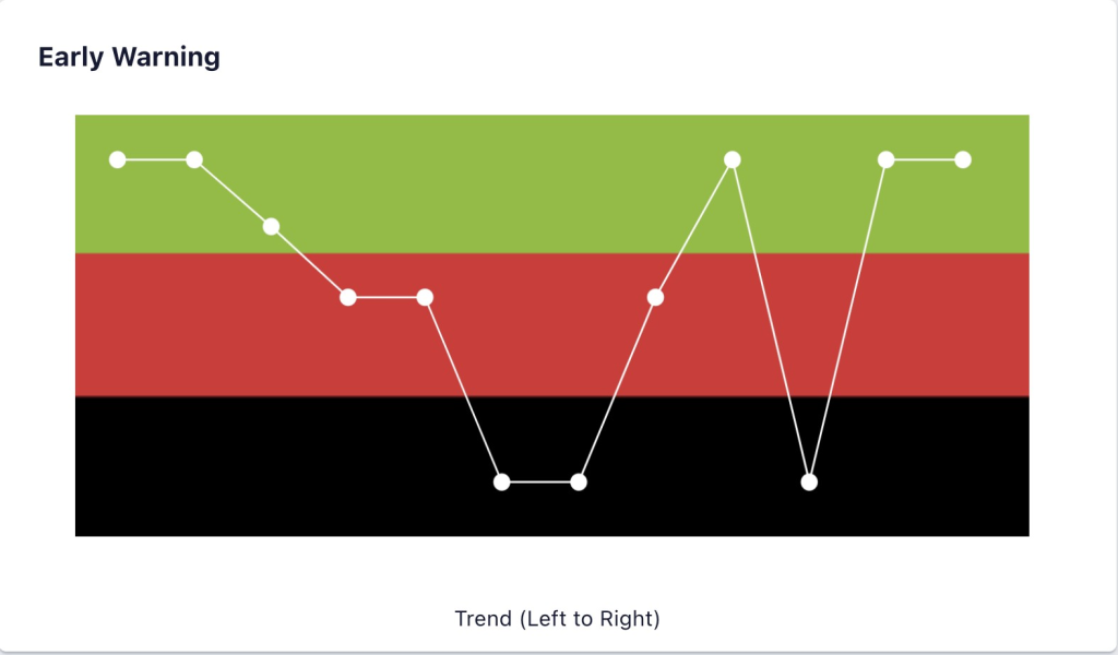 Figure 7.
Source: www.exepron.com
The cause and effect connectivity between the disruptive tasks and the action taken is very visible. More importantly it provides the information needed by the management team; when and where they must intervene. It will be the basis for formulating the recovery plan, in most cases while there is enough time remaining to protect the due date. This may occur any time during project execution.
Conclusion
So if we look at the proposed solution in its totality we will see the difference adding the third dimension makes. Now there is a way to measure and monitor the required time vis-à-vis the available time remaining to complete the project. Providing the key information to better manage the two essential necessary conditions for successful project execution:
- Stability
- Control
The Project Status Chart∗ for monitoring the actual Project Buffer penetration vis-àvis the actual Critical Chain remaining is a new key feature for monitoring the Stability of the project. The Early Warning∗ by adding the dimension of time remaining, displaying the impact of exceeding acceptable time ‘burn rates’ are now visible in a timely manner. Without this real time visibility of the time ‘burn rate’ a project may become unstable, jeopardizing meeting the due date. When Albert Einstein was asked to define time, he purportedly looked at the famous clock tower in Bern and said, “It’s what you get when you look at a clock.” When you run out of time, you cannot get any more.
There is a new additional Control capability when combining the Early Warning∗ and Tasks Requiring Immediate Attention∗ information. This pinpoints exactly when and where action must be taken, focusing the management team’s recovery efforts. While just as importantly will indicate when no action should be taken.
You may be able to get additional resources to mitigate the impact of poor project performance. However you may not have enough time available regardless of the increased support level. Remember this could be a time distance problem. If this is the case then the constraint is no longer the Critical Chain rather the Time Available becomes the constraint. The key is having the visibility and real time information while you still have the available time and the real time information of precisely what task(s) are causing the disruption. Once the appropriate action is taken the Critical Chain will become the true constraint again.
Note: ∗ Patent Pending
Daniel P. Walsh is a recognized authority on the Theory of Constraints, sought after lecturer and member of multiple corporate boards who can be contacted at danpwalsh@aol.com
He and John Thompson co-founded Exepron, www.exepron.com, a cloud-based Critical Chain business solution. Together they built on the previous efforts of others, leveraging the latest technology and means of delivering to develop new thinking. I would be remiss in not recognizing the tremendous gift Dr. Eliyahu Goldratt gave us all. I think he would have approved our attempts at furthering his legacy.


